Core Web Vitals: How To Improve Cumulative Layout Shift
7 May 2021 1 Comment ALL-HANDS SEO, TECHNICAL SEO
Picture this.
You’re reading an exciting article on the internet. At some point, the text suddenly moves, so you have to scroll the page to continue where you left off.
Or imagine an even worse scenario. You’re trying to add an item to your cart and all of a sudden a pop-up appears and pushes the page down. You accidentally click on the ad, finding yourself on a different site.
Sounds frustrating, doesn’t it?
And yet, it happens quite often.
Unexpected layout shifts damage user experience, resulting in higher bounce rates and lower conversions. Google is aware of the issue, so it does its best to address it.
In mid-June 2021, the search giant will roll out the Core Web Vitals update focused on user experience. One of its metrics indicates whether unexpected shifts happen on a given page. As you may have guessed, we’re talking about Cumulative Layout Shift.
In the following paragraphs, you will learn:
- What Cumulative Layout Shift is about
- How the metric is calculated
- How to measure Cumulative Layout Shift across your website pages
- And most importantly, how to improve your scores for this metric
This information will help you fix layout shift issues and ensure your pages provide a good user experience.
This blog post is the third in our Core Web Vitals series. To learn more about the upcoming update, make sure to read the first and second posts as well.
Cumulative Layout Shift (CLS) is a Core Web Vitals metric measuring the layout stability of a page. A poor CLS score indicates that a given page has unexpected layout shifts that prevent users from enjoying its content.
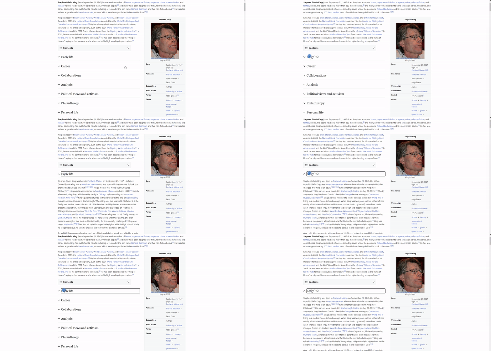
However, not all layout shifts are bad. For example, if you visit some Wikipedia page from mobile, you will notice that not all the page content is available at once. Some of it is hidden behind UI buttons. If you tap on them, the hidden content will expand, resulting in a layout shift.
Did this layout shift spoil a user’s experience? No, on the contrary, it was expected.
But it’s still a shift, so it should affect the CLS score, right?
Actually, no. If a layout shift happens within 500 milliseconds after user input, Google doesn’t consider it when calculating the Cumulative Layout Shift score.
Please note. If your website is slow and can’t update its UI within 500 milliseconds after user input, it will result in a lower CLS score. That’s why it’s always a good idea to speed up your site. Also, consider using placeholders that replace content until it is in load.
What’s also worth mentioning is that layout shifts outside the viewport don’t matter When it comes to calculating Cumulative Layout Shift, Google counts only layout shifts that are visible to users. Therefore, if a layout shift happens outside the viewport area and users don’t see it, such a shift won’t affect your CLS score.
If it’s clear, let’s learn how Cumulative Layout Shift is calculated.
Recently, Google has reevaluated the formula and now calculates CLS scores differently. In the following paragraphs, you’ll learn why.
How Cumulative Layout Shift used to be calculated
Not so long ago, Google would have calculated the CLS score by taking layout shift scores for all animation frames on a page and adding them together:
Layout shift score #1 + Layout shift score #2 + Layout shift score #3 = Cumulative Layout Shift score.
The layout shift score is calculated by multiplying the distance fraction by the impact fraction.
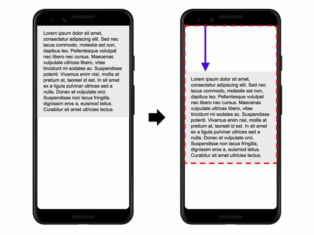
Simply put, the impact fraction is how much of the viewport area between two frames is impacted by an unstable element.
The distance fraction is the distance that an unstable element moves relative to the viewport.
You can learn more about how the distance fraction and impact fraction are calculated in this web.dev’s post.
So, Google would multiply the distance fraction by impact fraction to get the layout shift score for a single animation frame. Then, it repeated the process for each frame on a page until all the layout shift scores were calculated. And finally, the search engine added these scores together to receive the Cumulative Layout Shift score.
However, this method had a major drawback.
It turned out such calculations were unfair to longer pages.
Let’s take a social media page with infinite scroll, for example.
When a user is scrolling, new content comes piece by piece, and page elements may shift multiple times. Thus, the longer the user scrolls the page, the more layout shifts they experience. Even if these shifts are minor and almost unnoticeable, they will damage the CLS score dramatically as there are too many of them.
That’s why the Chrome Speed Metrics team decided to improve the metric by making it more neutral to the time spent on a page.
How Cumulative Layout Shift is calculated now
Google is now grouping layout shifts in session windows.
Session windows work the following way:
- When a layout shift occurs on a page, a session window opens.
- The window lasts up to five seconds but closes sooner if no layout shift occurs within one second after the previous shift.
- Google then takes a session window that has the most significant layout shifts.
- After that, the search engine adds up all the layout shifts within that single session window. Layout shifts in other session windows are ignored.
That’s how Google now calculates the Cumulative Layout Shift score of a page. This approach is fairer to longer pages as the total amount of layout shifts doesn’t matter anymore.
Now that you know how the CLS score is calculated, it’s time to measure Cumulative Layout Shift across your website pages.
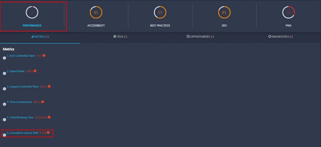
To measure your CLS scores fast and with no effort, you can use RankActive’s SEO toolkit. The Lighthouse feature of Site Auditor enables you to check the Cumulative Layout Shift score of any page.
Simply add your website to the project and visit the Lighthouse section.
You can check your score both for mobile and desktop devices. Click on the corresponding buttons to switch between available options.
By default, our tool shows the CLS score of your homepage. However, you can add the Lighthouse API key in settings so that you’ll be able to calculate Cumulative Layout Shift for any page.
If you notice that some of your pages have scores above 0,1, it’s time to make some improvements.
According to Google, poor CLS scores may be caused by:
- Font loading issues
- Dynamically injected content
- Images without dimensions
- Ads and embedded social media posts without dimensions
Thus, you can improve Cumulative Layout Shift by addressing the issues mentioned above.
#1 Optimize font loading
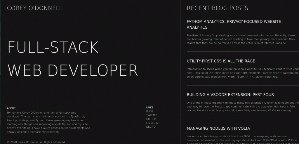
Late-loading fonts are one of the most common causes of layout shifts. If you are using fonts that are stored online (e.g., Google Fonts or Adobe Fonts), fetching and rendering these fonts may lead to FOIT (Flashes Of The Invisible Text) or FOUT (Flashes Of The Unstyled Text) issues:
FOIT is when a browser downloads fonts from a server and temporarily shows an invisible text while a custom font loads. The invisible text may take up a different amount of screen space than the custom font. Thus, once the custom font has loaded, a layout shift may occur, leading to a poor CLS score.
FOUT is when a browser displays one of the system fonts until the custom one loads. Given that the custom font may differ in size from the system font, it may also take up different screen space. As a result, your content may significantly move when the custom font has loaded.
To solve such issues, consider preloading fonts, using <link rel=“preload”>. That way, a browser will treat fonts as one of the top-priority resources and load them as fast as possible when rendering your page. Given that fonts will be loaded before other elements, layout shifts will be significantly minimized.
Note that you should preload only above-the-fold fonts because otherwise, you may slow down your page. However, even above-the-fold fonts may load for too long if a user visiting your page has a slow internet speed.
To minimize the impact of a poor internet connection, combine <link rel=“preload”> with “font-display: optional.” “Font-display: optional” tells a browser to render the custom font only if it’s available within 100 milliseconds after a user landed on a page. If it’s not, the browser will choose the fallback font but will still try to download and cache the custom one to display on the next page load.
However, when “font-display: optional” is used without <link rel=“preload”>, Chrome re-renders the page twice, whether the fallback or custom font is chosen. That causes a slight layout shift.
In Chrome 83, developers removed the first render cycle for custom fonts preloaded with <link rel=“preload”>. Instead, they blocked the rendering until the custom font has finished loading or 100 milliseconds have passed. That way, when you combine link rel=“preload” with “font-display: optional,” you ensure no layout shifts will occur.
But if you don’t like the options mentioned above for some reason, you might try to find the system font similar to your custom font (or vice versa). There are several tools enabling you to match fonts so that you can find an appropriate solution pretty quickly.
#2 Manage dynamically injected content
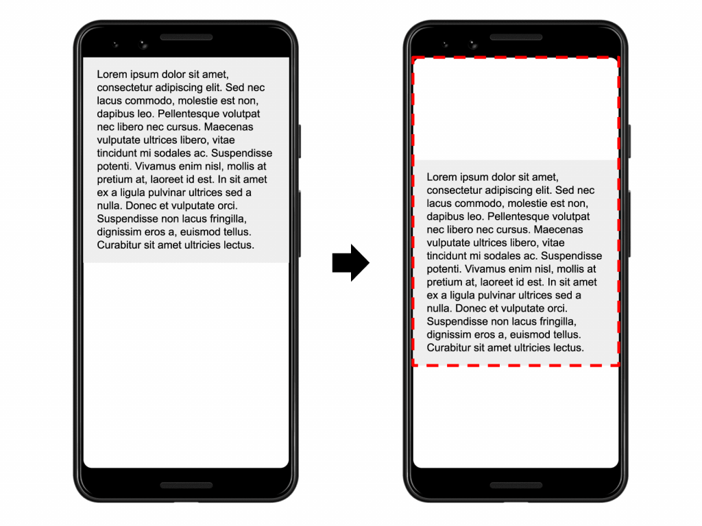
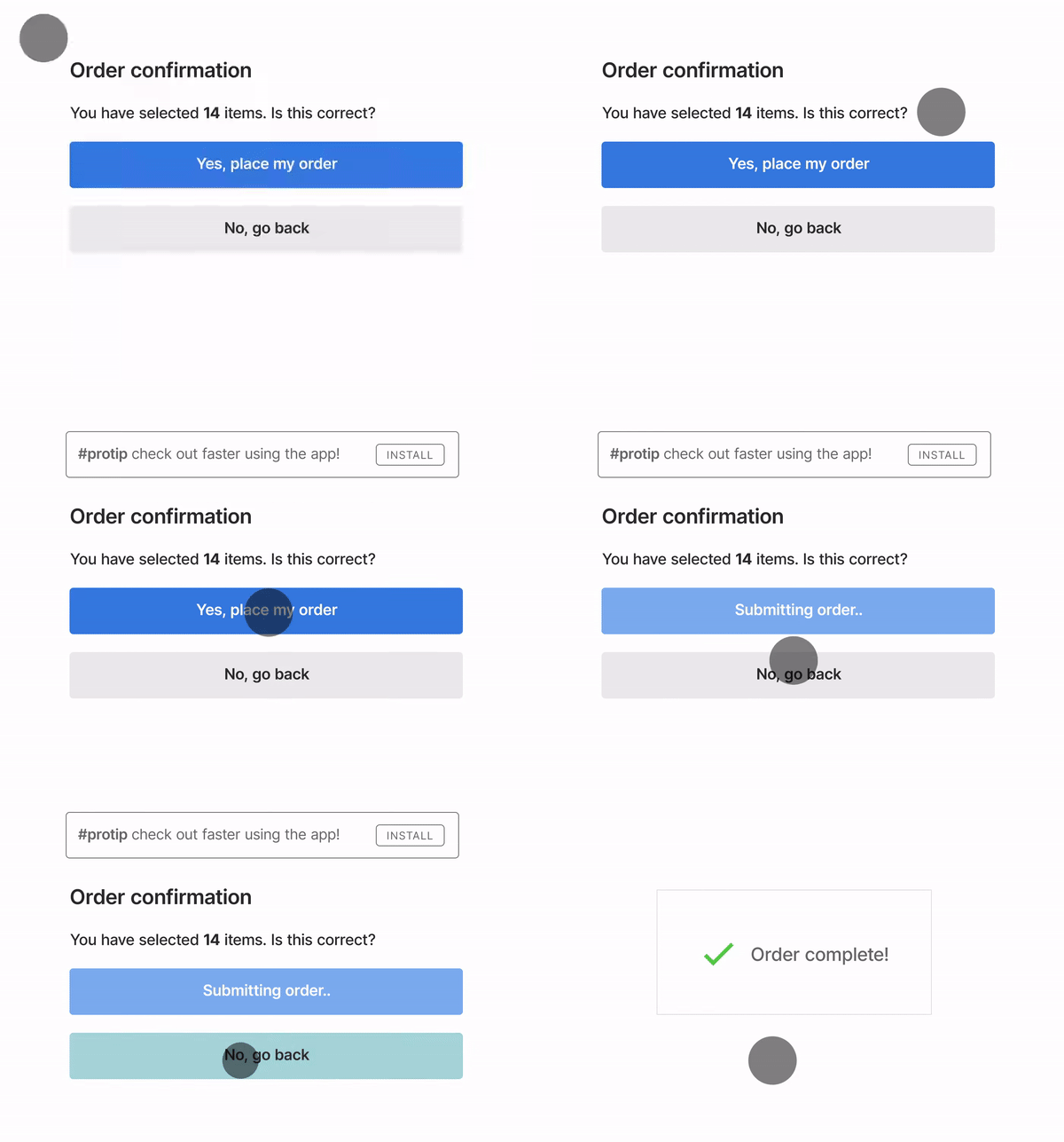
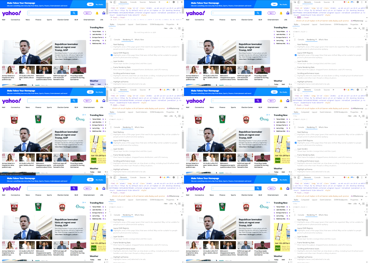
Dynamically injected content such as banners, opt-in forms, data privacy notices, and other elements can cause layout shifts if placed above the existing content. It often leads to a frustrating user experience, as in the example below.
To avoid such issues, either don’t place dynamic content above the existing static content or reserve enough space for dynamic elements with placeholders or the min-height and min-width CSS properties. That way, a browser will leave room on the screen for dynamic elements so that when they appear, they won’t move your page.
#3 Set image dimensions
When you specify the width and height attributes of images, a browser allocates enough space for these elements while rendering a page. Therefore, when they finish loading, they don’t move the content down.
However, when mobile devices dominated the world, developers started to use CSS to resize images so that they can fit different screen resolutions. The problem with this approach is that a browser is able to allocate space for an image only after starting to download it. Thus, as each image appears on the screen, the page layout shifts, causing a poor user experience and a higher Cumulative Layout Shift score.
To solve this problem, consider specifying the width and height of each image you add to your site.
What you could also do is leverage CSS aspect ratio boxes to let browsers set the default ratio of images. Just set the width or height of an image and specify the aspect ratio with CSS. That will enable browsers to calculate the missing attribute and get the dimensions before rendering the page. By doing it, they can allocate enough space needed for the image while it is still loading. As a result, once the image has loaded, it won’t cause even a tiny layout shift.
As for responsive images, you can use the srcset attribute when dealing with them. Basically, this attribute enables you to define a list of different image resources along with images’ size information. That allows browsers to pick the most appropriate image based on the resolution of a device from which a user landed on your website. However, manually adding each screen resolution to the list would take forever. That’s why we believe it’s better to specify the resolution range for each device type (desktop, mobile, and tablet).
#4 Reserve enough space for ads and embedded social media posts
Just like images, ads and embedded social media posts (embeds) also contribute to unexpected layout shifts.
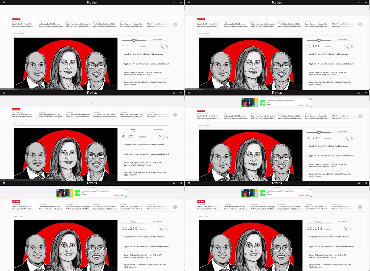
As you probably know, the vast majority of ad networks prefer dynamic ad sizes instead of fixed dimensions. Since ads are stored on different servers, they load slower than the rest of your content. Therefore, if you don’t reserve some space for an advertisement in advance, it will push your content, leading to a higher CLS score.
Alternatively, if you leave some room for ads in your website’s code, no layout shift will happen.
So use CSS to reserve some space for future ads. Consider reserving the largest place possible so that even big ads won’t move your page. However, if a smaller ad comes, it will leave blank space in the reserved slot, so keep this in mind when designing your page layouts.
Please note. If no ad is returned from the network, the reserved slot may collapse, causing a layout shift. To prevent this, use a placeholder.
The same goes for embeds. If you want to embed a social media post, make sure to specify its dimensions before placing it on your site. Each social media post may differ in size, depending on what content is used in it. That’s why you should inspect the post you want to embed with Chrome DevTools, discover its height, and then style a placeholder with the right height so that enough space is reserved for the post to load into. That will save you from a layout shift.
Everybody has their ups and downs, but your content shouldn’t have them. To ensure your pages won’t move unexpectedly, follow best practices from this article and improve Cumulative Layout Shift across your website pages.
While fixing unexpected layout shifts, don’t forget about other issues on your website. Use RankActive tools to analyze your site from different perspectives so that you will know what to improve.
Start making your website a better place today, and traffic won’t take long to come. Create your account right now and test our toolkit for 14 days for free.
Tags: Core Web Vitals, Lighthouse, RankActive, Site Auditor
Like this article? There’s more where that came from.
- 5 Questions to Ask Yourself Before Paying for Rank Tracking Software
- 5 Serious Mistakes Beginner SEOs Make and How to Fix Them
- Why We Use Google’s New Link Attributes and You Should Too
- Title and Description in 2021: Why Google Rewrites SEOs’ Meta Tags
- What We Should Learn From Google’s “About This Result” Feature

