What Design Mistakes Can Hurt SEO? [Updated]
9 April 2021 2 Comments ALL-HANDS SEO
Creating a new website or redesigning an old one? Make sure to avoid these 11 common design mistakes that can hurt your SEO efforts and decrease conversions.
#1 Non-responsive design
Is it even worth investing in responsive websites? Nowadays, the answer is “yes” for any niche. When creating a mobile-friendly design, everything must be taken into account: fonts, the buttons’ size, how text and images are placed on the screen, and so on.
Starting from September 2020, Google is switching to mobile-first indexing. This update suggests that mobile website versions now play the leading role in rankings and indexing. Google states most users surf the web via smartphones, so it’s no wonder the search giant does its best to meet their expectations.
Besides mobile-first indexing, Google also introduced the Core Web Vitals update, which will be rolled out completely in May 2021. The update will combine the Core Web Vitals metrics with the search engine’s existing signals to estimate the user experience a page provides. Pages that provide a poor user experience on mobile will be outranked by those that offer good UX.
In addition to already existing UX signals, Google will be estimating pages by three new metrics: Largest Contentful Paint (LCP), First Input Delay (FID), and Cumulative Layout Shift (CLS).
We already described LCP and CLS in our non-technical guide to Lighthouse metrics. But since this update is crucial for SEO, let us recall the most vital points.
Largest Contentful Paint measures the time it takes a page to display the largest above-the-fold content element on the screen. The “above-the-fold” term suggests content available without scrolling. To calculate LCP, Google identifies which content element is the largest on the page. For example, if you have a header image that is larger than a header text, Google will consider the header image as the largest content element. That means this element takes the most resources to be painted.
Given that images are often the largest content elements, we recommend using only compressed and optimized images (more on that in the following paragraphs).
To get a high score, your largest content element on the page should be displayed within 2,5 seconds.
First Input Delay detects the responsiveness of the page. In simple terms, it measures the time from when the user can interact with content on the page to the time when a browser can respond to that interaction. Ideally, your page should respond in less than 100 milliseconds.
If your page looks interactive but doesn’t respond to the user input within a reasonable time, the user may assume the page is broken and leave it. That way, you’ll lose potential customers, increase bounce rates, and damage your SEO efforts.
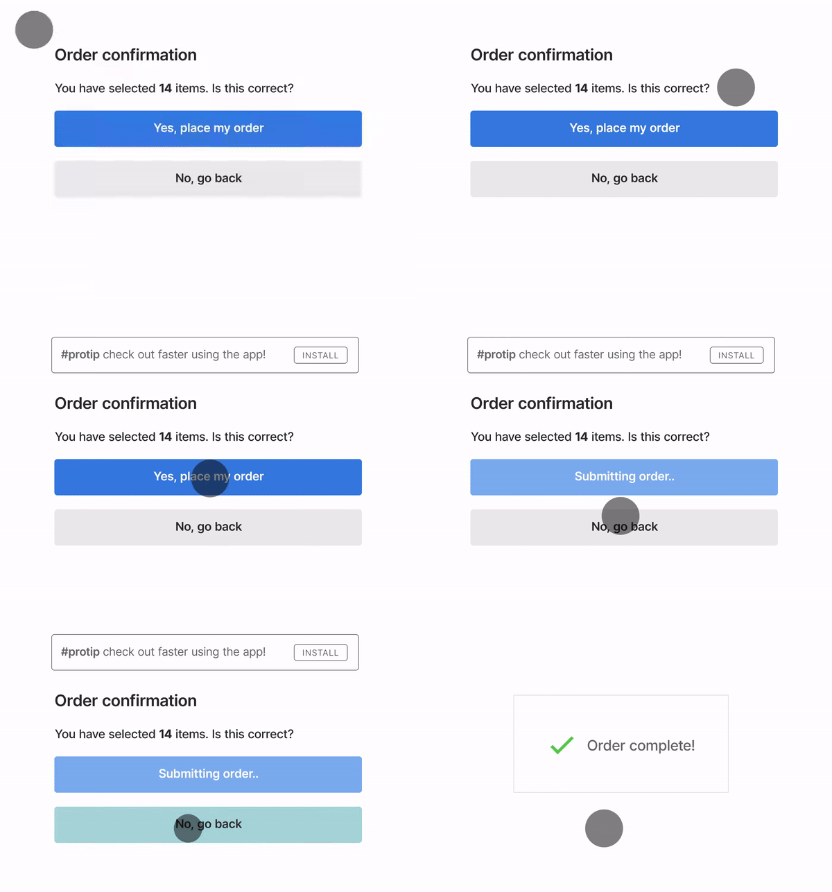
Cumulative Layout Shift measures the movement of visible elements within the viewport. Simply put, this metric estimates the visual stability of webpage content.
By optimizing your pages for a good Cumulative Layout Shift score, you’ll reduce sudden movements of their content (see example in the screenshot).
Such movements irritate users, so if you have them on your pages, your visitors will have a hard time exploring your site. That can definitely damage your SEO efforts and conversions.
By the way, these issues are often caused by images that load too late, so it’s another reason why you should stop using large, non-optimized images.
Given that the Google Core Web Vitals update is coming in less than a month, you should start optimizing for it when you still have time. You can already check your webpages’ score for Core Web Vitals metrics using the RankActive’s Lighthouse tool: all the metrics you need are available there.
If you discover that your website has low Core Web Vitals scores, the first thing you should look at is your images. That brings us to another common design mistake.
#2 Images are way too large
No doubt, stunning imagery makes your website look great. However, if you use too large images and media files, they may negatively affect your website’s loading speed, resulting in higher bounce rates.
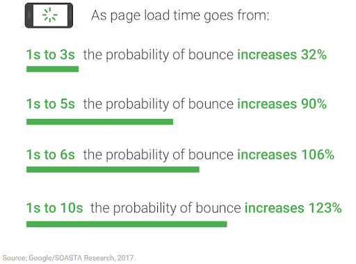
According to Google and SOASTA research, the longer a page loads, the higher its bounce rate.
If your website loads for too long due to excessively large images, you can expect to lose potential customers and sales.
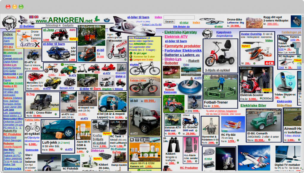
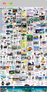
Here is a typical example of imagery abuse:
Looks horrible, doesn’t it?
Let’s have a look at its mobile version:
We can assume users are not having a good time surfing this website.
So if you also have pages with too much imagery, consider decreasing it.
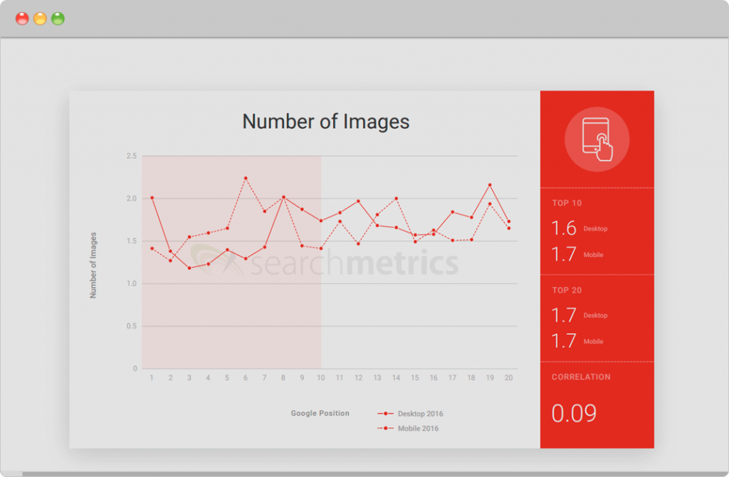
According to the survey by Searchmetrics, websites ranking in TOP-10 don’t have more than two images per page, enabling them to load pretty fast.
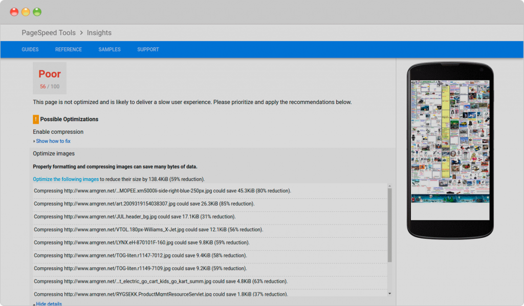
As you probably know, Google rewards pages that load quickly. If you want to improve your website speed, check it for large content elements that may affect its performance. You can do it for free with Google’s PageSpeed Insights test.
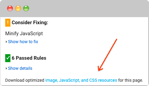
The page on the example above could be optimized by reducing its images’ size by 59%. It would help the page load faster and get better Core Web Vitals scores. In addition to that, Google enables webmasters to download optimized images directly from the PageSpeed Insights website.
After downloading optimized images, one could reupload them to their website and increase its loading speed.
However, just having optimized images isn’t enough. You should also ensure you don’t use text in images.
#3 Text in images
Having text content in images may negatively impact rankings.
First off, search engines don’t see images as we do. They aren’t always able to recognize text in images. So if you include text in an image instead of adding a text layer over it, the search engine will assume your page doesn’t have any text content at all.
In addition to that, images are not vectors, so the text will become distorted when zooming (which doesn’t happen when you use actual text). Moreover, text in images can’t be translated with page translation services such as Google Translate, so some of your visitors who don’t speak your target language won’t be able to understand your content.
Here are four tips that will help you mix text with images properly:
- Provide alt text for images. Simply assign images with alt attributes in HTML to provide search engines with a text description of your media content.
- Choose images that show a complete sentence. A subject of the image should be crystal clear, so it won’t be difficult for users to understand the action being taken in the image.
- Do not provide important business information in the image. Placing your business contact details inside images on your footer is not a good idea because your potential customers won’t be able to copy and paste this important info.
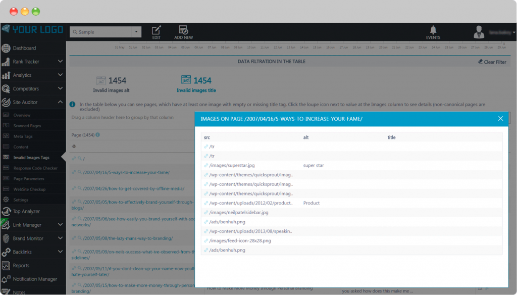
- Use advanced tools to find out how search engines view your website. For this purpose, you can leverage RankActive’s Site Auditor. This tool will help you quickly locate all the links and headings on your site.
Another common design mistake we often see is that many webmasters add more images and less text.
How do you communicate with first-time visitors on your website? By providing enough information about your business, right?
It’s a simple fact, but still, many entrepreneurs are falling into the trap of adding more beautiful images than vital info.
No doubt, such industries as travel or photography require high-quality visuals, but every website has a limited “image space.” At some point, your site may start loading too slow because of the visual overdose. And as you already know, slower loading times will result in higher bounce rates.
A recipe for success is to balance text and visual data on the page. Depending on the branch, searchers should easily find the most important information: product descriptions, prices, contact information, and so on. Only after finding a place for it can you add vivid images of a reasonable size.
While focusing on your website’s content, you shouldn’t forget about its quality. Many webmasters make several content mistakes, which prevent them from driving decent organic traffic.
#4 Poor content
Apparently, pages containing information about your services and products are of the greatest importance for your website. Your success is prompted by your target keywords and rankings.
The most common mistake related to poor content is the absence of product or service pages on the website, which can limit your ability to rank for your target keywords.
The second mistake many website designers make is listing all company’s products and services on one page. It can cause ranking issues as search engines rank each page according to its content.
Moreover, having one page for all the products and services you offer may damage conversions. And what also may decrease conversions is missing or not-optimized CTA.
#5 Missing or poorly-optimized CTA
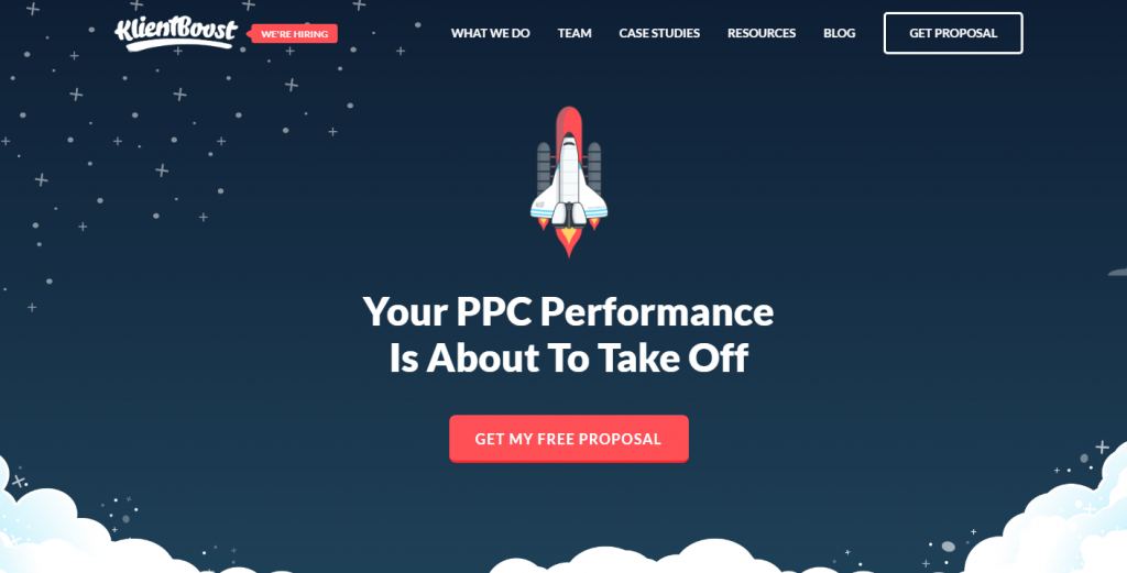
Every website has a product to offer, be it books, clothes, services, or information. But how easy can visitors get to the final goal – a purchase?
CTA buttons contribute to your conversions, so neglecting them doesn’t only hurt your SEO efforts but can potentially damage your business.
To avoid losing potential buyers, follow these best practices of highly-converting CTAs:
- Use first-person phrases. Instead of “Start your free trial,” make it personal and replace it with “Start my free trial.”
- Add actionable words: “do it”, “buy it”, “try it”. Such phrases may encourage users to purchase from you.
- Leave some free space for a CTA. Don’t clutter an interface with buttons or images. Also, use contrast colors to make the CTA button easy to discover.
To convert even more visitors into customers, you might also try pop-ups. They are an effective marketing tool, which can help you boost sales dramatically. However, if implemented wrong, they will prevent your visitors from exploring your website, which brings us to the next point.
#6 Wrong pop-up implementation
Back in 2017, Google rolled out the interstitial update. The search giant warned website owners that “pages, where content is not easily accessible to a user on the transition from the mobile search results, may not rank as high.”
Google is concerned about user experience, especially on mobile devices. Obviously, poorly optimized pop-ups make exploring your website less pleasant, so it’s no surprise the search engine finds them disruptive.
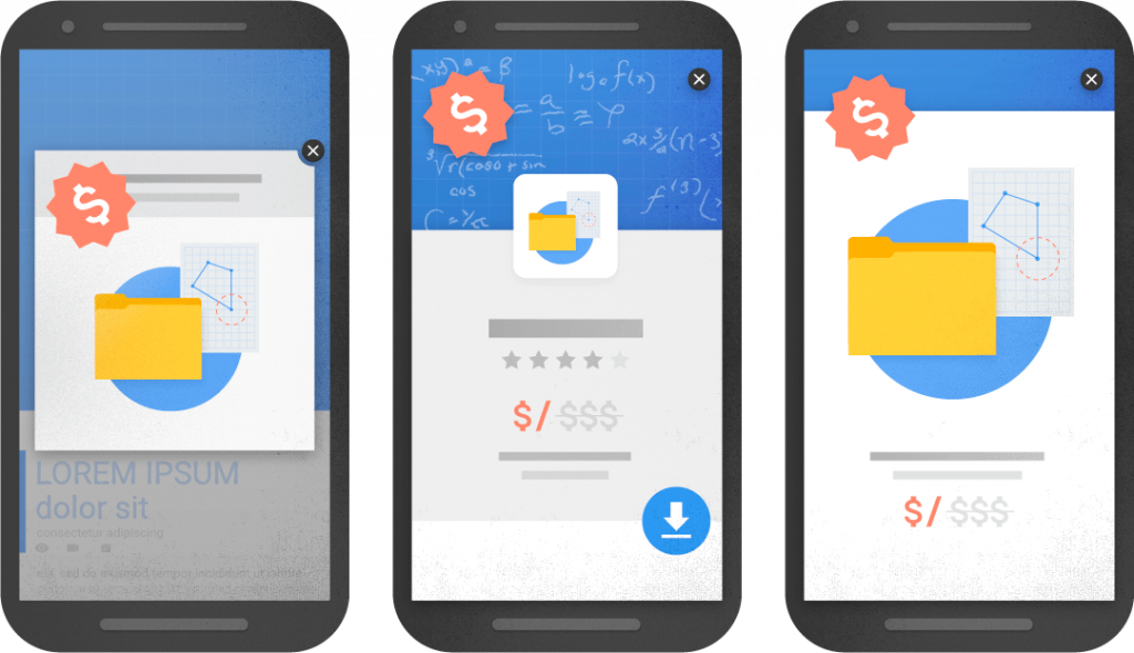
Here are three examples of interstitials that make content less accessible, according to Google:
But don’t get us wrong, pop-ups won’t prevent your website from ranking high if you implement them the right way. To do that, follow these best practices:
- Make sure your pop-ups don’t appear right after users land on your site.
- Ensure ads occupy a reasonable amount of screen space.
- Make your pop-ups easy to close.
- Avoid using new-window ads that open when a user clicks somewhere on your website.
- Make your pop-ups load fast.
If you follow these recommendations, Google won’t take any action against your website.
Nevertheless, you should be careful with pop-ups as they often irritate website visitors, leading to higher bounce rates. But what annoys users even more is audio and video content that plays automatically right after they visit some page.
#7 Auto-playing video or audio content
Imagine this. You’re clicking on some link and then hear someone talking or some music playing out of nowhere. The next thing you probably do is go back to search results.
It happens when website owners add video or audio files with the autoplay feature. Some of them believe it makes their websites more exciting and interactive. However, it’s wrong.
In most cases, people don’t expect something to make sounds on the page, especially without their permission.
What if a user is sitting in the library or working at the office?
Such awkward situations won’t encourage visitors to complete a purchase.
In addition to that, Chrome is now effectively blocking roughly half of unwanted media autoplays, so the autoplay feature may not work as well as before.
Yet, sometimes videos are the best way to demonstrate the product’s functionality, so why give up on them? Of course, you shouldn’t do it. You can still place the autoplay video but put it on mute so that visitors can turn the sound on if they want to. That way, you won’t irritate anybody.
To provide an even better user experience, you can add captions to the video. That way, visitors will be able to fully understand the video content even if they can’t play it with sound on for whatever reason. It might also help you increase dwell times.
Speaking of video content, some webmasters used to add too many Flash videos to their sites, which resulted in indexing issues. More on that in the following paragraphs.
#8 Using too much Flash
No doubt, Flash was once good-looking and could make your website visually attractive. Yet, at the same time, it was not search engine friendly.
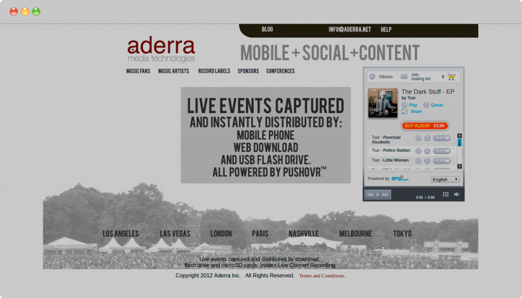
Take a look at this typical flash-based website:
It looked great, but optimizing such a website for SEO was pointless as crawlers couldn’t scan flash-based components. As a result, they left most of its content unindexed.
But it isn’t even important anymore because Flash is no longer supported since December 2020.
Adobe stopped supporting its Flash Player due to several security issues. The player was vulnerable to malicious data injection, exploit problems, cross-scripting attacks, and plenty of other issues. You can find the full list of Flash’s security vulnerabilities here.
For all these reasons, it becomes apparent that using Flash for websites in 2021 is the most pointless thing to do. If your website still has Flash-based content for whatever reason, we strongly recommend switching to alternatives such as HTML5. Otherwise, your content will end up unindexed.
What also may lead to several indexing issues is the wrong infinite scroll implementation.
#9 Infinite scroll
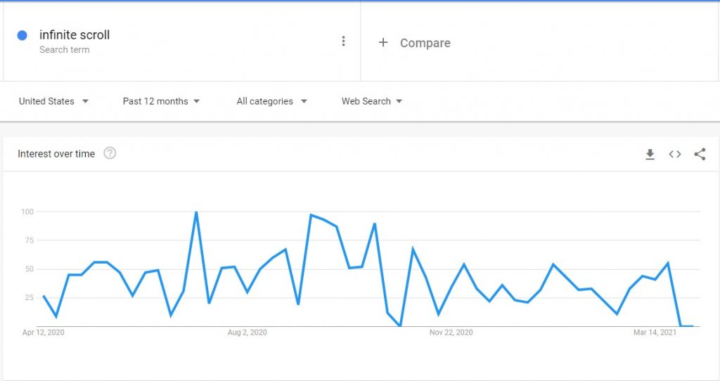
According to Google Trends, infinite scroll still remains a trending topic.
Social media websites with large amounts of user-generated content implement it to provide users with the most efficient way to surf that tsunami of information without having to wait for pages to preload.
For example, Twitter has implemented infinite scrolling successfully. From a user’s perspective, all tweets in the feed are equally relevant, so the user is likely to scroll down to the bottom. Since Twitter is a real-time platform, its feed updates instantly even if the user leaves it unattended.
However, infinite scroll doesn’t fit every website.
Suppose you have a blog with 300 pages and decided to enable infinite scroll on it. Obviously, you don’t want to show all pages at once. So you set, say, 10 to 20 pages to be displayed by default, and these default pages are the only ones that search engines can see. That happens because crawlers parse websites through links. In our case, infinite scroll makes it impossible for them to discover the rest of the content beyond these 10-20 top articles, which causes indexing issues.
But if you still plan to use infinite scroll on your website and don’t want to compromise between design and SEO, we suggest you follow the instructions Google Webmaster Blog provides.
All in all, infinite scrolling can be an innovative approach with a significant impact on the interface. If your website visitors are goal-oriented, meaning they need to find specific information quickly, this feature is what you are looking for.
But in some cases, it’s better to find some other ways to improve website navigation.
Speaking of which, we believe it’s time to discuss the most common navigation mistakes website creators make.
#10 Navigation flaws
What if a potential buyer visits your online store but can’t make a purchase because it’s unclear how to do it? The result is higher bounce rates, less time spent on the page, and, finally, a decreasing conversion rate.
We have to mention mobile design once again: when you think through the navigation aspect, mobile devices should be taken into consideration. What’s easy to discover for a desktop user may be hard to find for a mobile visitor.
To provide a good user experience, consider the following.
Don’t add too many links to the menu
If you have lots of pages, it’s better to put them into subsections. Our short-term memory keeps up to seven items, so this is the best number for menu links.
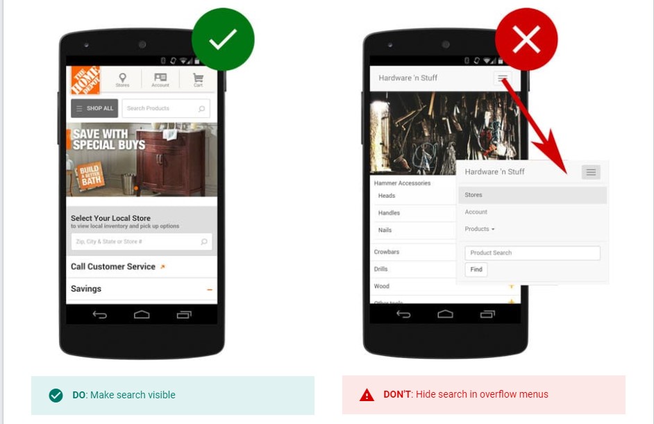
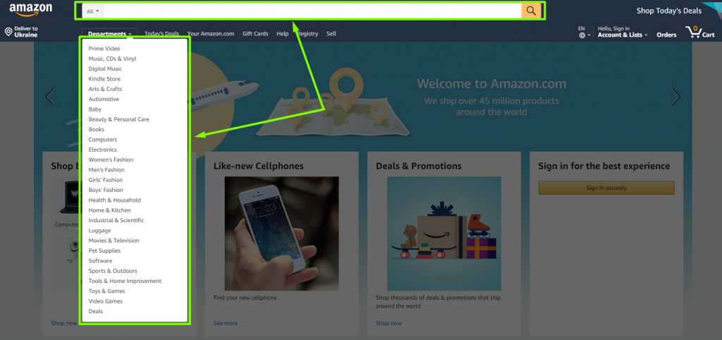
Place a search bar on top of the page
It is especially important if you deal with an eCommerce website or a blog.
Some business owners hide the search bar in a menu, making it hard for users to find it.
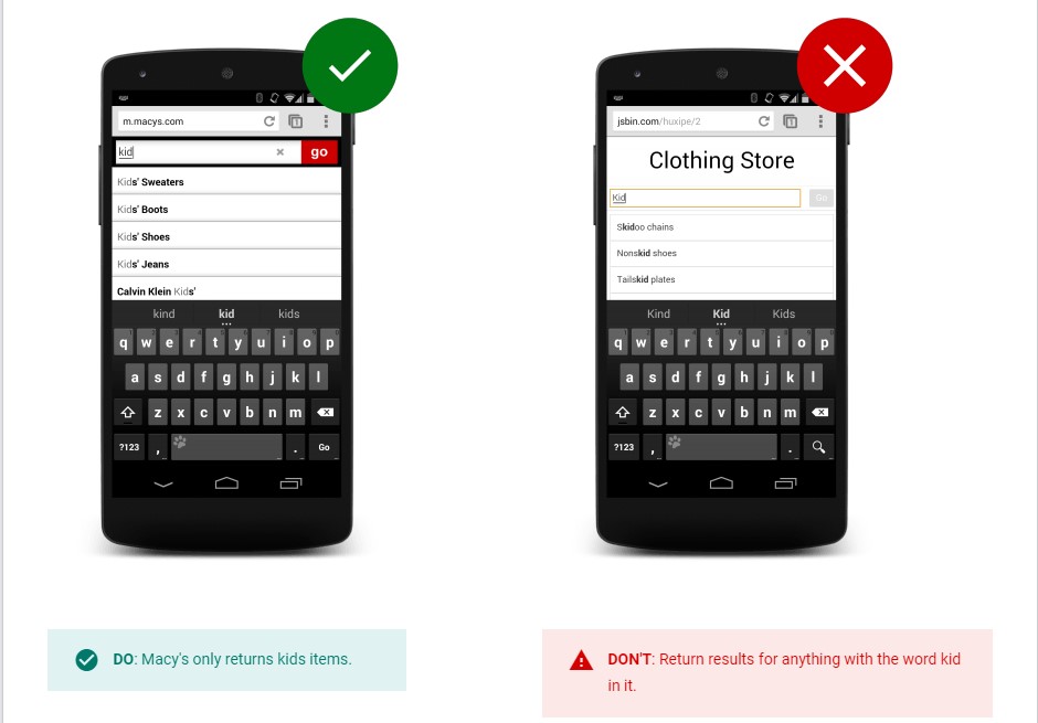
Another issue concerning search bars is that they often return irrelevant results.
If you don’t want to frustrate your website visitors, make sure your search bar provides them with what they’re looking for. That way, you may increase conversions.
Use traditional header and footer placements
Don’t do any experiments in this area. Web users intuitively look for the essential information on top of the page, so you shouldn’t place it anywhere else.
Make sure your website buttons are optimized for mobile devices
Clicking on a button isn’t difficult at all, but what about tapping? It’s an entirely different action. Our fingers are not as precise as the mouse pointer, but sometimes designers neglect this fact completely.
Even if a website has perfect navigation, the small size of its buttons may ruin the whole user journey. It’s like walking in shoes that don’t fit you. Imagine how high bounce rates can become because of this small detail.
To ensure the buttons are of the right size, check the Material Design guidelines. They will help you create a clear mobile interface. What can also help you improve website navigation both on mobile and desktop is transforming its genetic 404 pages into something more creative and user-oriented.
#11 Generic 404 page
We bet you don’t want to lose a potential customer who might have visited a broken link on your website or just typed a wrong URL. A broken page without proper navigation can negatively affect the user experience, resulting in lower dwell times. To avoid it, use our tips on how to create an appropriate 404 page.
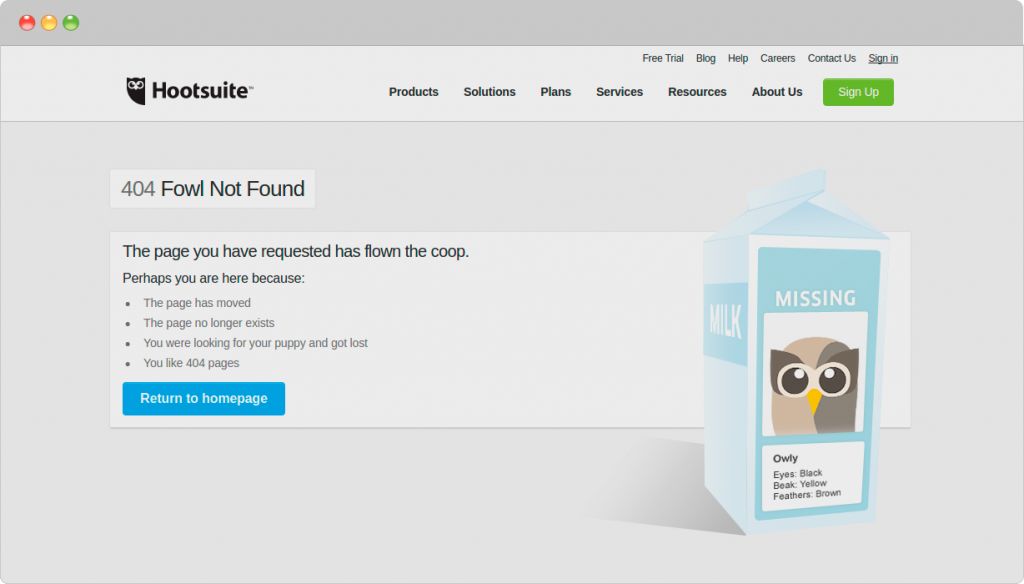
1. Include a link to your home page
That way, you will increase the chance of the user staying on your website.
2. Be creative
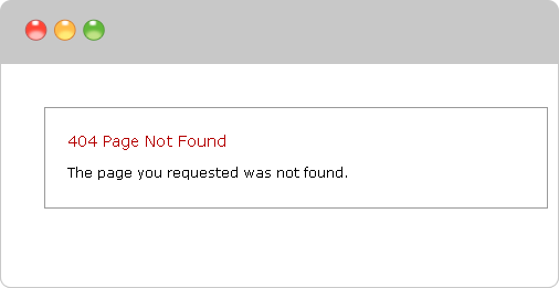
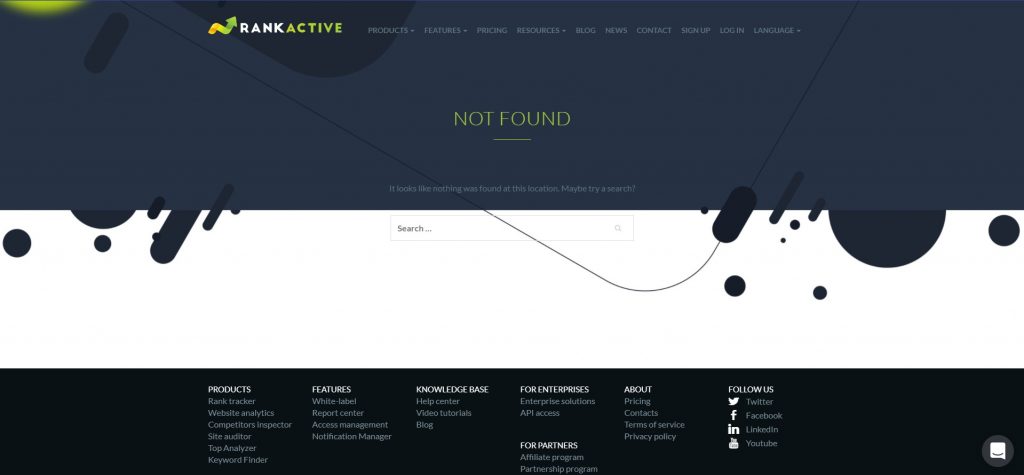
Don’t make boring 404 pages like this one:
As you can see, this page has no navigation buttons, which may confuse the visitor, making him bounce back to search results.
3. Include a search engine
Some of your visitors may use it to find the necessary information.
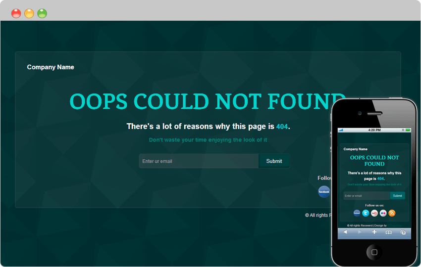
4. Use an email link to enable visitors to report problems
While this approach is not very common, it can help you build an email list. As an example, you might take a template created by the team of W3 Layouts.
Conclusion
Finding a good balance between SEO and stunning web design isn’t easy. However, you should do your best to achieve it. While most website owners would agree that traffic and conversions are more important than impressive visuals, you shouldn’t neglect one for the sake of another. You can build the most attractive website ever, but if it’s slow as a snail, no one will stay long on it. Alternatively, if your website is super fast but uglier than a mud fence, don’t expect your visitors to convert.
That’s why while designing your website, you should keep an eye on its performance. For such purposes, use RankActive’s SEO toolkit. It will help you analyze your website from different angles and optimize it better. Create your account right now and test our tools for 14 days for free.
Tags: Core Web Vitals, Design Mistakes, Lighthouse, RankActive, Site Auditor, Web design
Like this article? There’s more where that came from.
- 5 Questions to Ask Yourself Before Paying for Rank Tracking Software
- 5 Serious Mistakes Beginner SEOs Make and How to Fix Them
- Why We Use Google’s New Link Attributes and You Should Too
- Title and Description in 2021: Why Google Rewrites SEOs’ Meta Tags
- What We Should Learn From Google’s “About This Result” Feature


