RankActive Reports 2.0: How to Create and Customize Your Own Report
21 October 2020 Leave a comment WHAT'S NEW
Hi RankActive user! As you may already know, we have completely updated our tool, providing some new features and also redrafting the old ones. We paid particular attention to the reports because they were not customizable before — you could only add your logo using the “White label” feature. That was definitely not enough for creating comprehensible and detailed reports.
That’s why we decided to rework this feature completely. The job is done now, so let us introduce you — Reports 2.0.
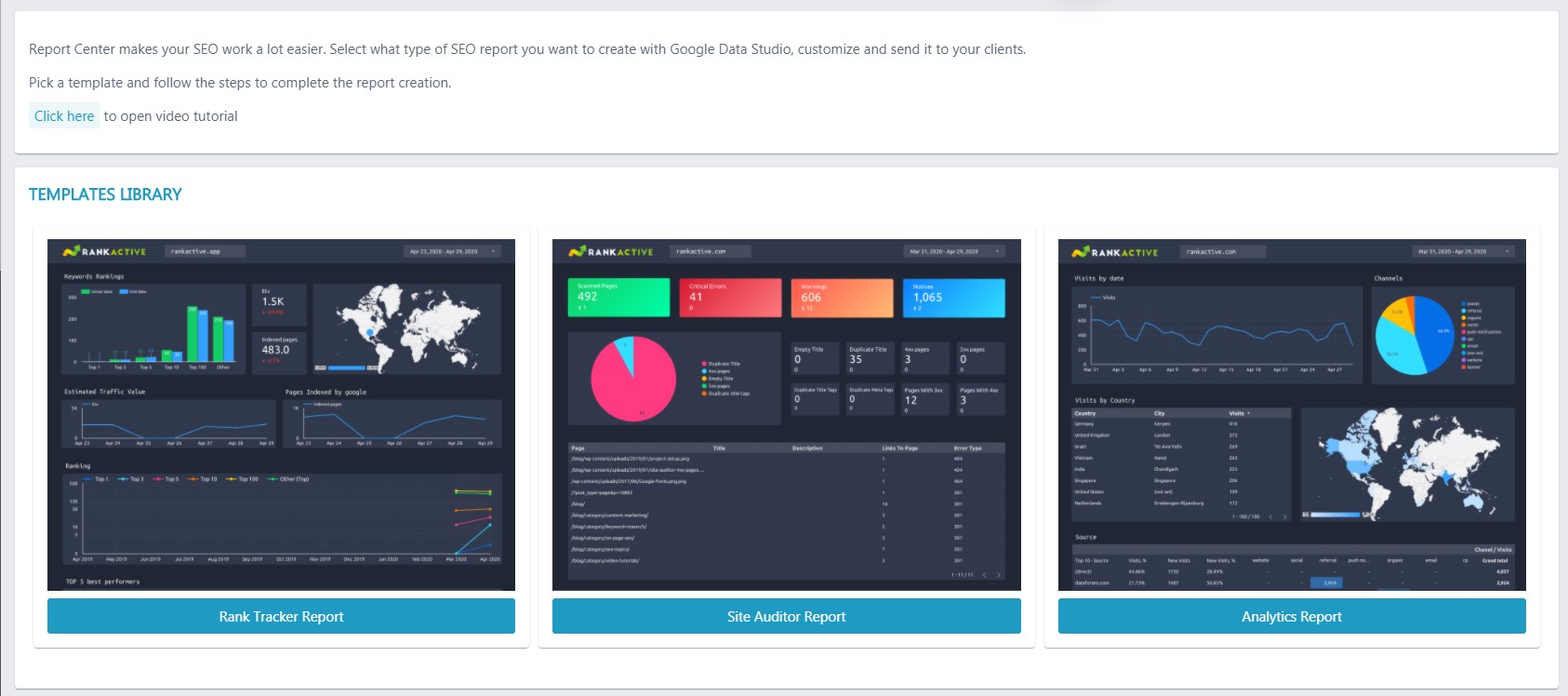
Three customizable reports for comprehensive SEO analysis
Using the Reports feature, you can create three different reports:
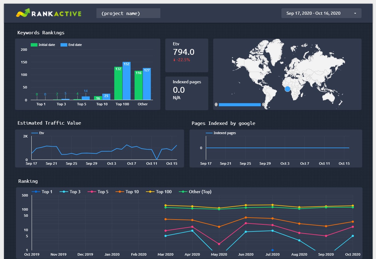
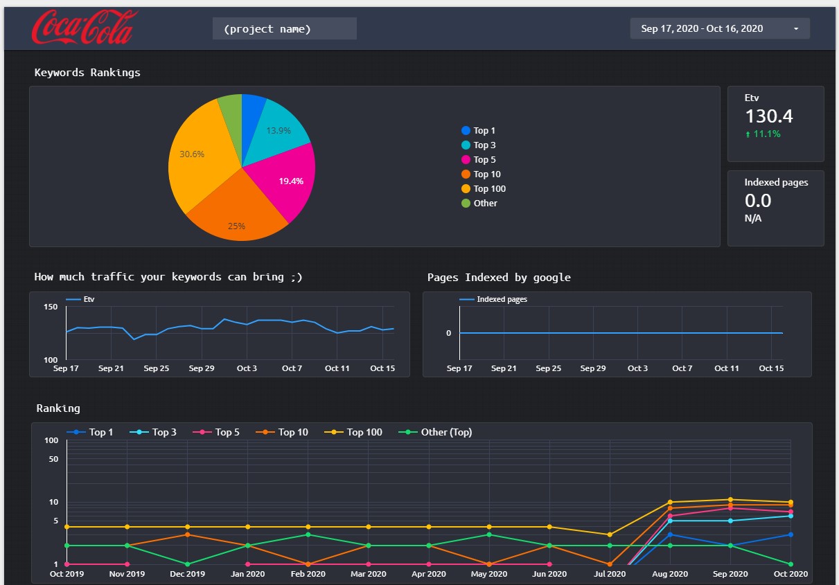
1. Rank Tracker Report. It will provide you with your website’s rankings. You’ll be able to see how many keywords rank in Top 1, Top 3, Top 5, Top 10, and Top 100, how many indexed pages your site has, which keywords perform best, and other useful information.
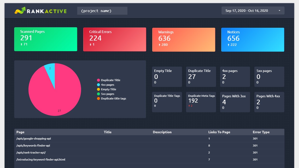
2. Site Auditor Report. It shows info about a website’s performance. Using it, you’ll discover how many issues your site has, including 3xx. 4xx, and 5xx pages, duplicate titles, duplicate meta tags, and other useful insights.
3. Analytics Report. It is designed to provide you with your website’s traffic insights. It will help you understand what countries your visitors come from, what sources bring you the most traffic, how many visits you have on each day of the month, and so on.

You can customize each report and edit every chart however you want. That will help you create a comprehensible report that can be easily understood even by a non-SEO person.
Let us actually show you how to create this. Since Rank Tracker is our most popular tool, let’s create a Rank Tracker report.
How to create and customize your own report
To create a report, go to the Reports section and choose from the available templates.
We will choose a Rank Tracker report just to show you how everything works.
After clicking on the blue button, you will be forwarded to Google Data Studio. Tick your marketing preferences and click “Save.”

Then choose the desired project from a dropdown list.
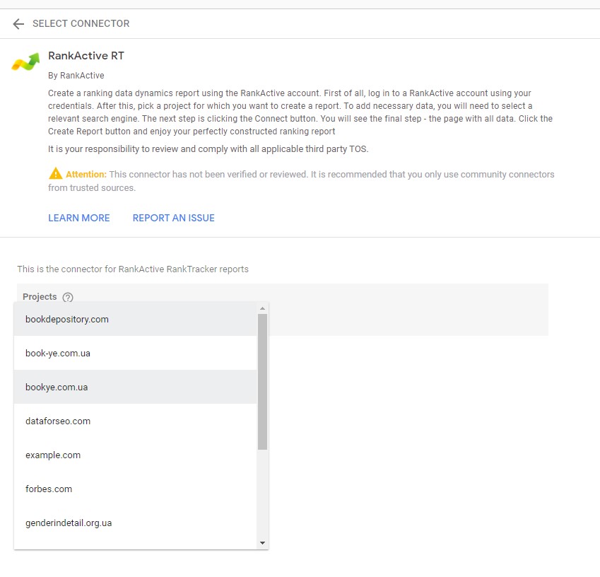
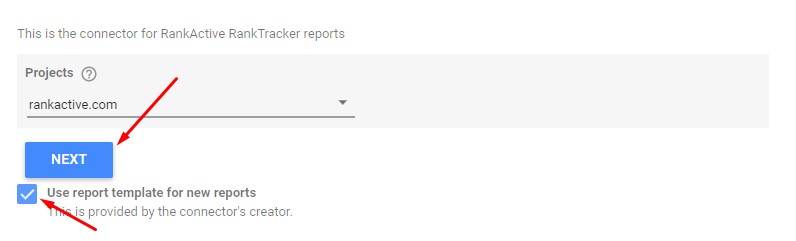
We will use rankactive.com for this particular case. Make sure the “Use report template for new reports” option is on and click “Next.”
After a few seconds, you will be asked to select the desired search engine.
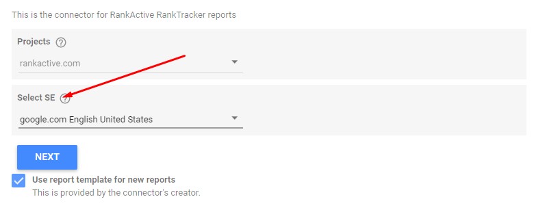
Select it and click “Next.”
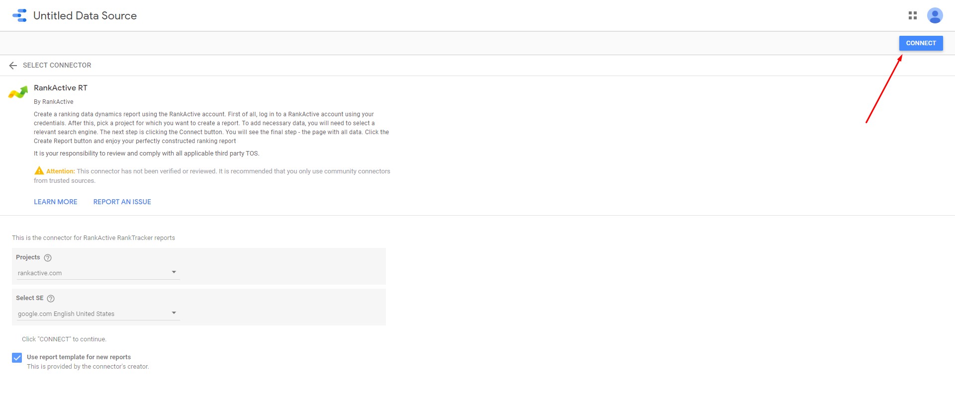
After that, click the “Connect” button in the upper right corner.
Then click the “Create report” button.

You will see this window.
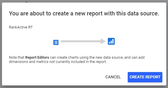
Click “Create report” again and wait a few seconds until it loads.
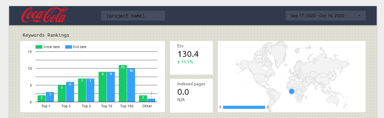
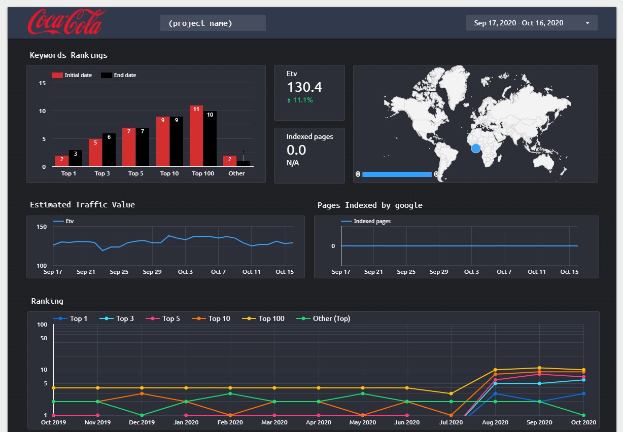
You will get something like this:
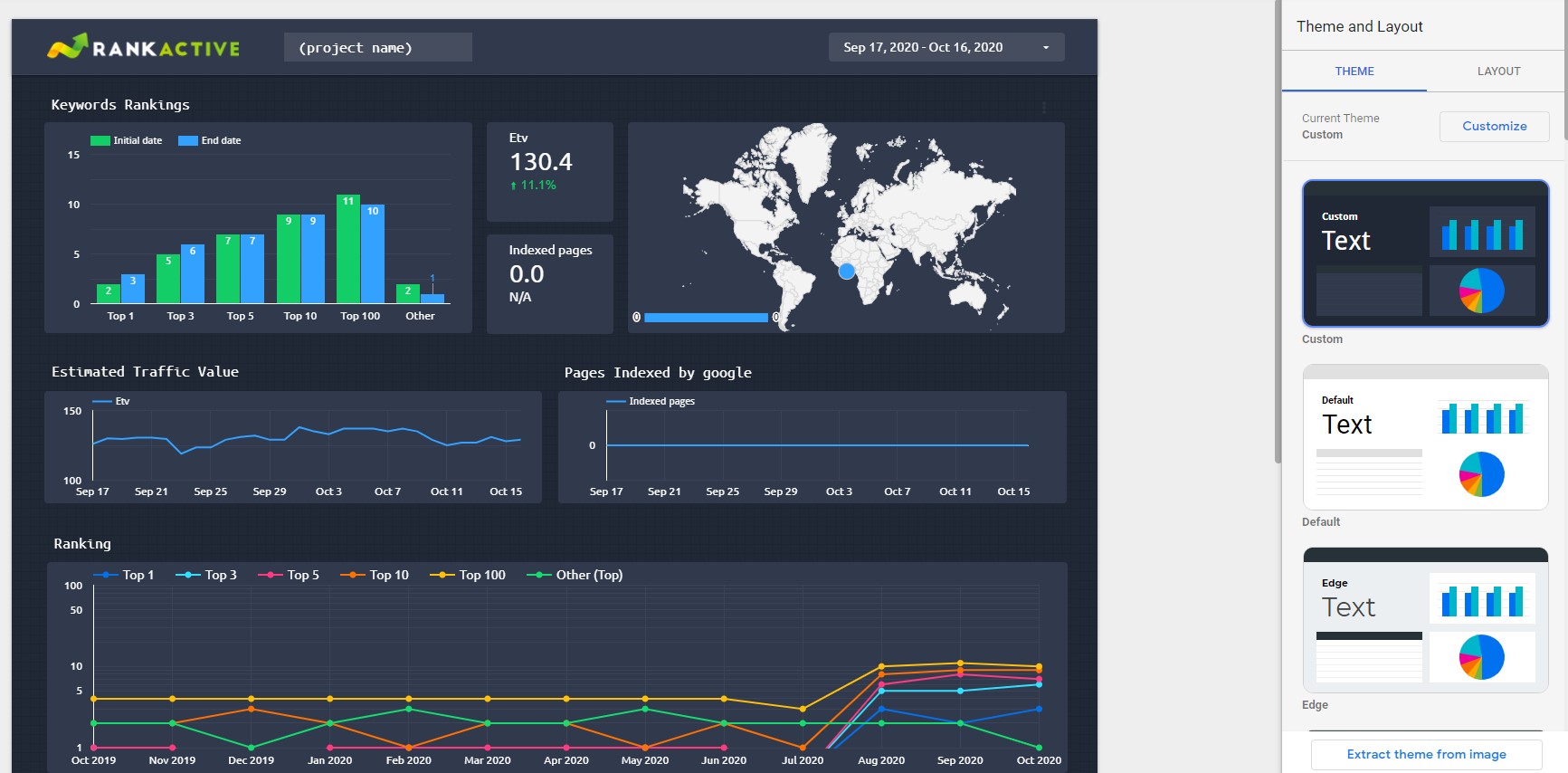
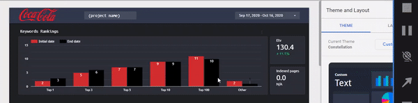
Now you can customize the report before sharing it. Let’s see how it can be done. First of all, you can select the desired theme to change its look completely. Let’s choose the “Groovy” one.
Then you can set the layout. Let’s keep it that way because everything already looks fine.
By default, the report has RankActive’s logo in the upper left corner. But you can change it with yours (you don’t need to use the “White label” feature for this anymore). To do that, click on the logo and select the image from your computer.
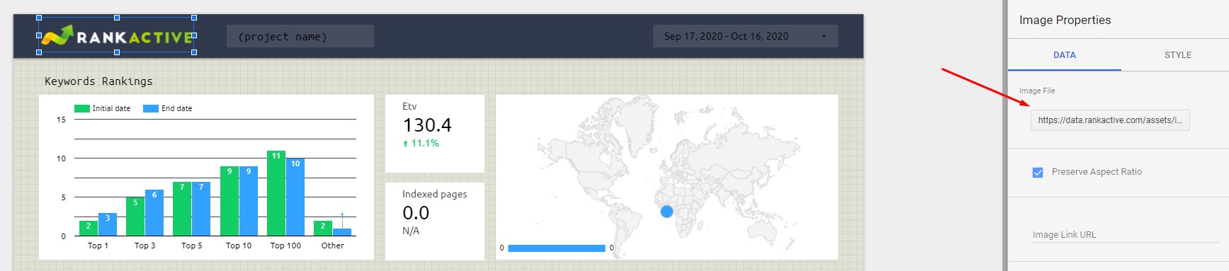
We chose the “Coca-Cola” logo 🙂
Now the chart’s color looks a little bit off, but it’s okay — we can change it. To do that, we should click on the graph and go to the “Style” section.
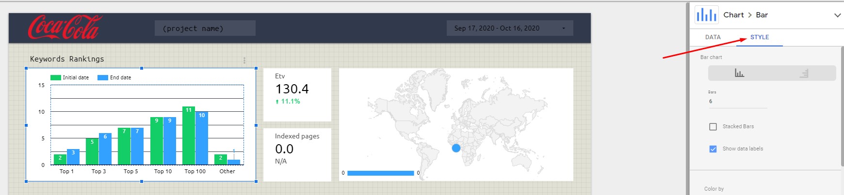
There we will find the “Color by” option.
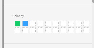
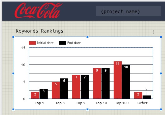
Let’s select black and red for this particular case.
Now the chart looks way better.
That way, you can change the color of every element of your report.
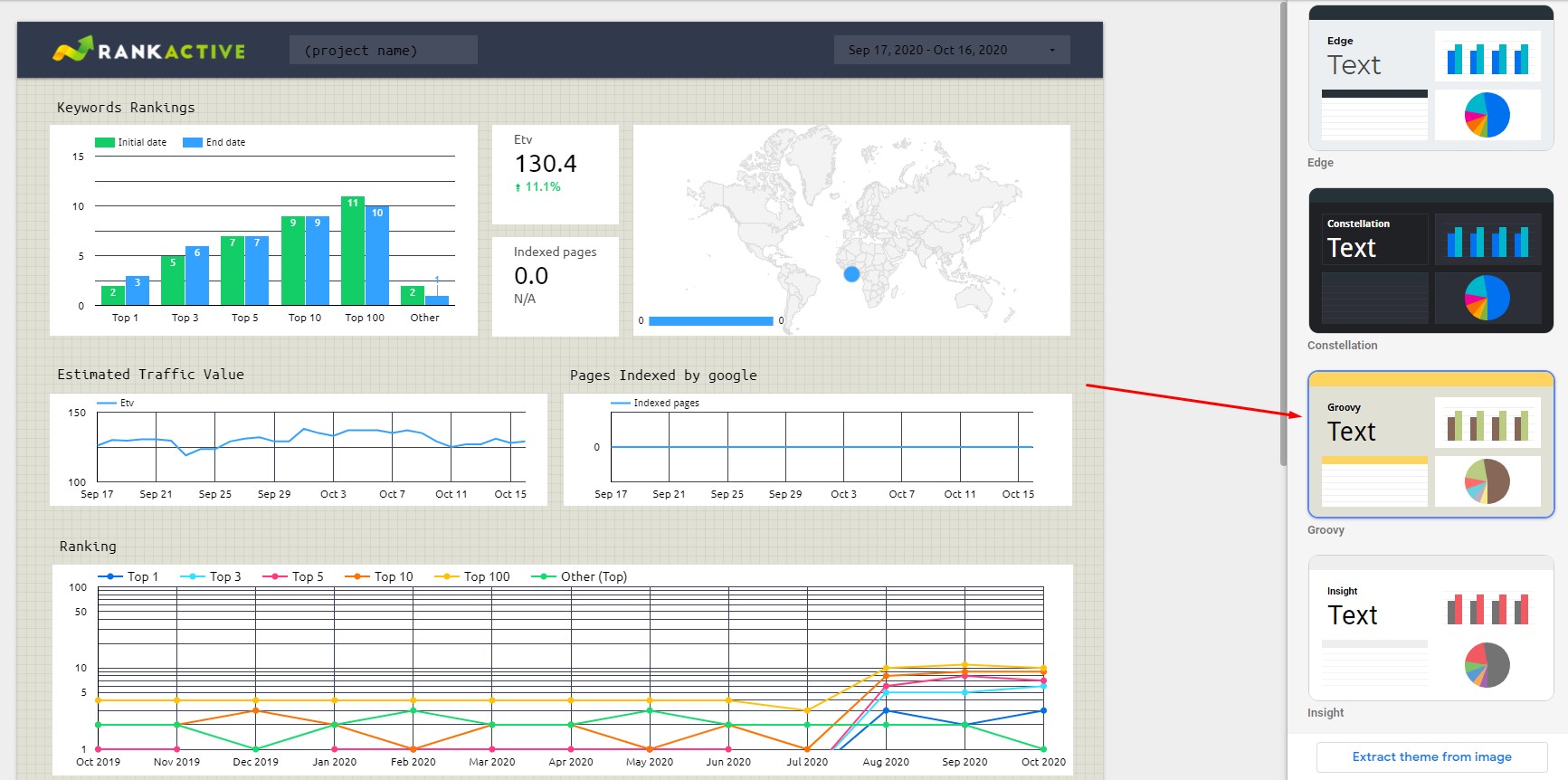
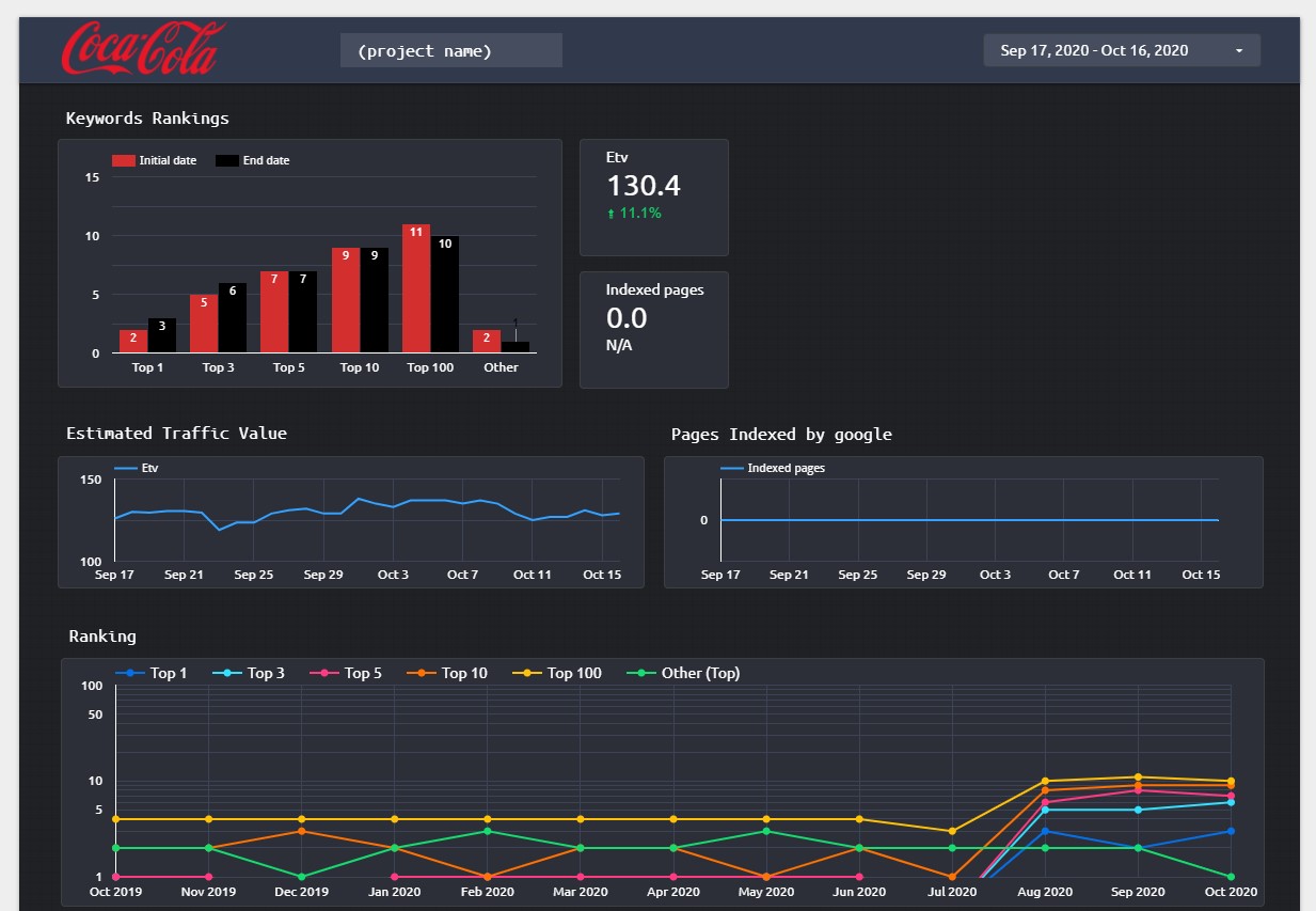
Actually, the “Groovy” theme doesn’t look good with the Coca-Cola logo, so let’s select the “Constellation” one instead.
Much better!
What else could we change? Pretty much everything!
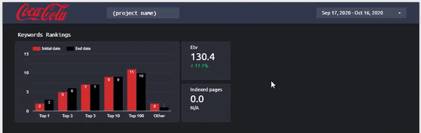
Let’s say you don’t need the map from Google Analytics. That’s totally okay — you can select and delete it. Click on the map and hit “delete.”
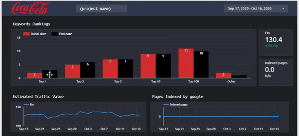
Now the report looks a little bit empty, but we can fix this. Let’s drag the “Etv” and “Indexed pages” boxes to the right.
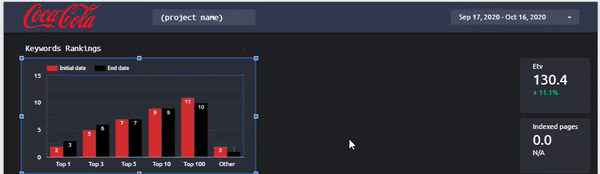
Now let’s change the size of the “Keyword Rankings” graph to cover the emptiness.
Don’t worry if you do something wrong. You can always hit “Ctrl + z” to undo the last action.
Now the report looks like this.
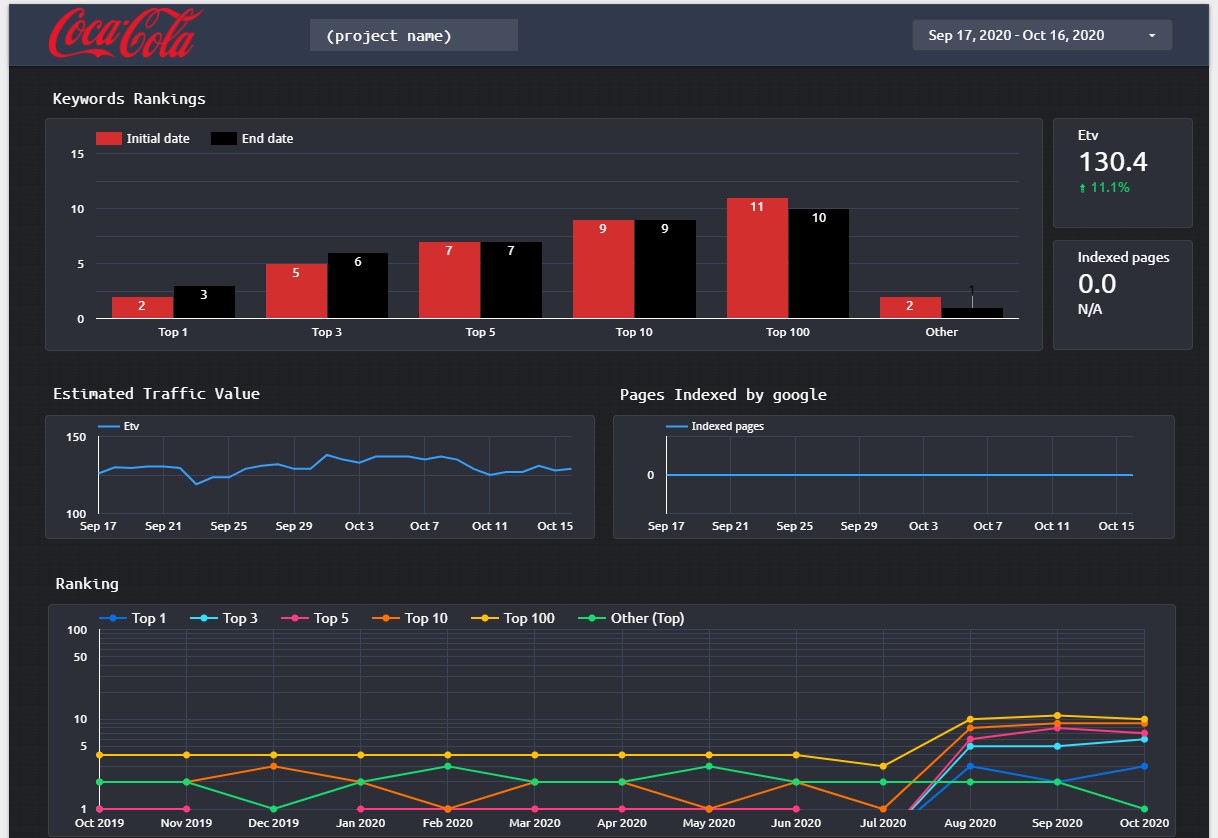
Suppose you are going to show this report to somebody who doesn’t understand the SEO jargon. They wouldn’t understand what “Estimated Traffic Value” is. You can rename it easily. Just click on the chart title and type something you believe is more comprehensible.
Maybe that’s not the best explanation, but you got the point 😉
That’s what we have for now:
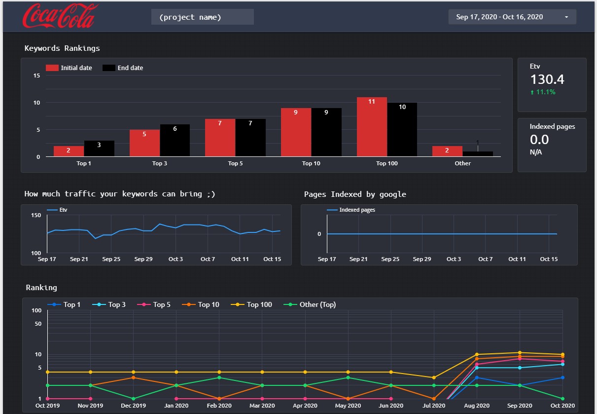
What else could we change? Let’s say you don’t like how the “Keyword Rankings” section looks. You want it to be a pie chart instead of a column chart. That can be changed quickly. All you have to do is click on the chart and select the desired chart type from the menu.
Now the look of our report has completely changed.
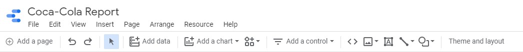
We can go even further and add some extra elements to make the report more appealing. Using buttons from the menu, we can add custom images, text, arrows, lines, and different shapes.
Since this is the “Coca-Cola’ report, let’s add the image of a bottle of this delicious drink. To do that, we should click on the image button and select the image from our computer.
Let’s do this right now.
Here is what we got.
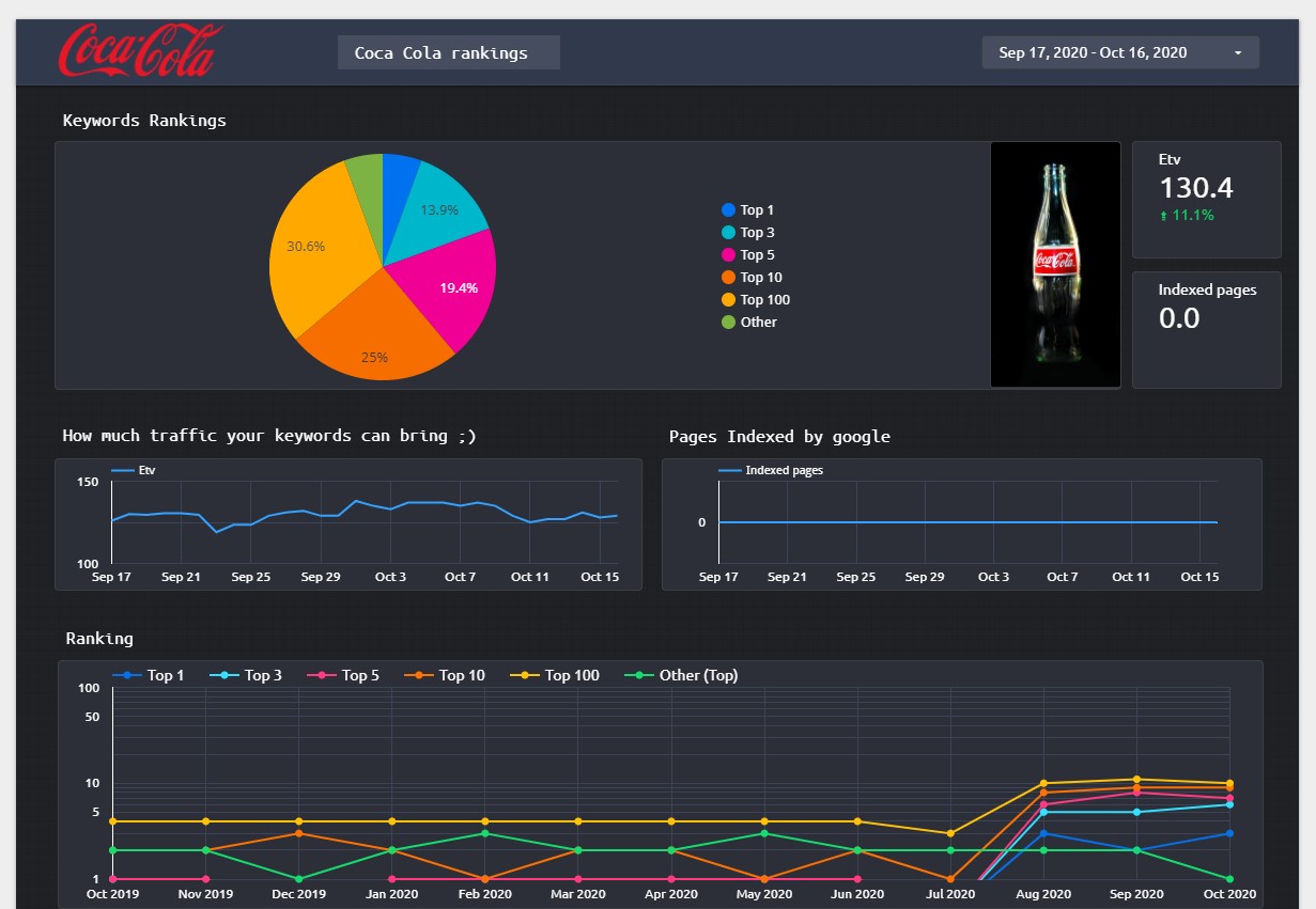
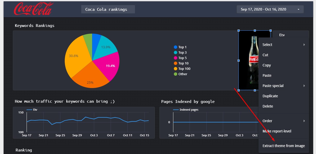
It looks a little bit off, doesn’t it? Let’s use some magic to fix it 🙂
If we right-click on the image, we can then extract the theme from it.
Let’s select the most appropriate one to see how it changes the report’s look.
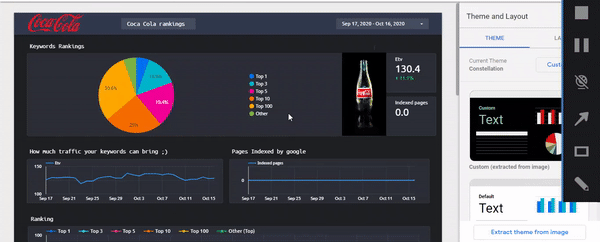
Much better!
If it isn’t enough for you, you can change every metric of the report. Suppose you don’t want the “Indexed pages” box to be there — it didn’t work for some reason when we were writing this 🙂 You can change it with something else. For example, let’s change it with the average keyword position. To do that, we should click on the “Indexed pages” box and select another metric from the menu.
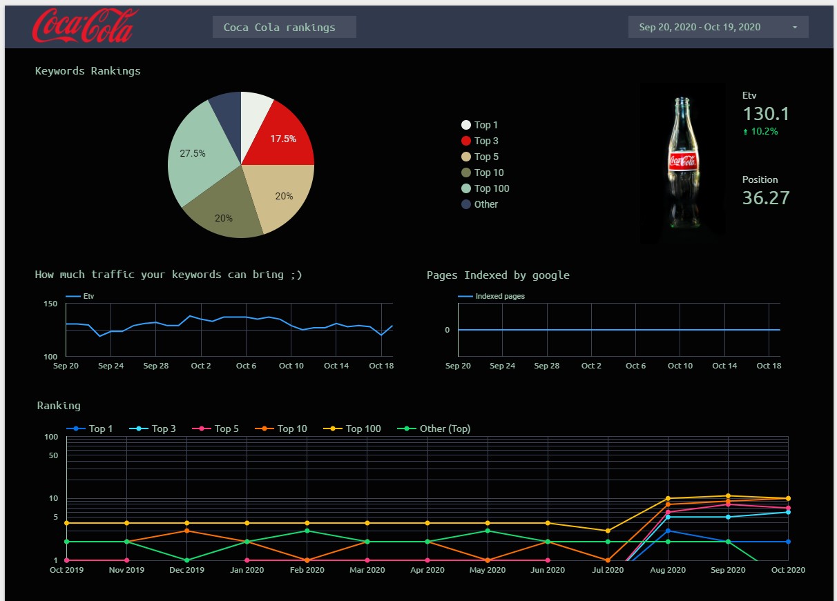
The job is almost done. Before sharing the report, there is one last thing to do — specify the project name. Let’s type “Coca-Cola Rankings.”
And it’s done
Now you got the customized report, which you can share with your customers and colleagues. You can still edit it in the future and modify its every element if you want to.
This report is fully interactive, which means it shows real-time data extracted from the Rank Tracker tool. Hence, you and your colleagues don’t have to sign in to RankActive to track the website rankings anymore. Just share the report with your team — that way you won’t have to manually add users within RankActive’s interface.
Theory aside, go experiment with your own report — it’s really fun!
Tags: Analytics, rank active update, Rank Tracker, Reports, reports 2.0, SEO reports, Site Auditor
Like this article? There’s more where that came from.
- 5 Questions to Ask Yourself Before Paying for Rank Tracking Software
- 5 Serious Mistakes Beginner SEOs Make and How to Fix Them
- Why We Use Google’s New Link Attributes and You Should Too
- Title and Description in 2021: Why Google Rewrites SEOs’ Meta Tags
- What We Should Learn From Google’s “About This Result” Feature